

The Ugly Truth About Ugly PowerPoint Slides
By Michelle Mazur > January 6, 2013
Filed Under Presentations
With so many blogs, books, and classes dedicated to designing beautiful PowerPoint slides, you have to wonder why there are so many ugly, dense, bar charts of doom looking slides in business presentation?
I have a confession to make. I AM a part of the problem. If you are in the corporate world, most likely you are too.
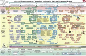
Ugliest PowerPoint slide of all time!
There is an ugly truth about PowerPoint that no one in business wants to discuss. It is one of the main reasons for an overabundance of crappy looking slides. The truth is…and I hope you are sitting down for this…
PowerPoint is used liked Word
I know it is sick and wrong, but it is very true. In the business world, PowerPoint is now the standard for writing reports. It has been for a very long time. It's not going to change. The dense slide with 100s of words and maybe a picture are here to stay.
It gets worse. These report slides are then dropped into PowerPoint presentation decks and taken to speaking engagements around the country. It's the awful business truth. If you work in the corporate world, you know exactly what I mean. With the million emails you get a day, clients to make happy and employees to manage, you frankly don't have the time to redo the report you just spent a month writing into a slick looking presentation deck.
It's a lot of work to take a chart with 27 bars and reduce it to a stunningly simple numerical representation. Sometimes (most of the time) bar #26 is the metric your client wants to see.
Speaking needs to shine to overcome the slides

Your Speaking needs to shine to overcome your slides
You, the business professional, now can embrace your ugly slides; however, there is a trade-off. It is your job to take the emphasis off the ugly and showcase your own speaking skills. Here are several pointers for helping your audience navigate your slides.
- Do not read your slides – they are not a teleprompter – talk to your audience. If you read them the slides, they don't need you! Unless you are going to serve them warm milk before they fall asleep in your presentation.
- Know what's important to your client – You are the expert on the information you are presenting, but you also are the expert on your client and what they need. Understand their pain points and challenges and solve those in your presentation. If you solve their problems, they won't care about your horrific slides.
- Find the story – as you practice your presentation (yes practice is a must) focus on the story you want to tell. You are the audience's GPS. Take them on the trip that will solve their business woes. Navigate them through your slides and presentation. Don't lose sight of your story.
- Edit your slides down – No one expects your slides to look like a priceless Van Gogh, but spend 30 minutes getting rid of the text you know you are not going to discuss. If it is not relevant to the story, highlight and press delete. It will make your slides slightly more audience friendly.
In business, ugly and overwhelming PowerPoint slides are something we have to get use to. However, those crappy slides put more onus on your speaking skills. Your speaking skills can overcome bad PowerPoint slides.
Disclaimer #1: This post is for those who do business presentations only – if you are another type of speaker – don't think I gave you carté blanche to create ugly slides.
Disclaimer #2: I love Nancy Durate's book slide:ology: The Art and Science of Creating Great Presentations![]() and Garr Reynold's book Presentation Zen: Simple Ideas on Presentation Design and Delivery
and Garr Reynold's book Presentation Zen: Simple Ideas on Presentation Design and Delivery![]() . In my presentations I do my best to apply their Jedi slide design principles. I love Haiku Deck for making it so easy to design fabulous looking slides. If disclaimer #1 applies to you, I recommend checking out those books and the app.
. In my presentations I do my best to apply their Jedi slide design principles. I love Haiku Deck for making it so easy to design fabulous looking slides. If disclaimer #1 applies to you, I recommend checking out those books and the app.


