How to Create Compelling PowerPoint Presentations
Today's post by Marta Jabłońska of Improve Presentation takes us back to the PowerPoint basics and gives great tips to create compelling PowerPoint slides.
A few people left the room. Some audience members were yawning and the rest were pretending to listen. All thanks to a PowerPoint presentation and unfortunately it was the speaker’s fault. PowerPoint can give you power, but the point is to use it reasonably. Here are few useful tips to create compelling PowerPoint presentations.
Table of Contents
Easy to read
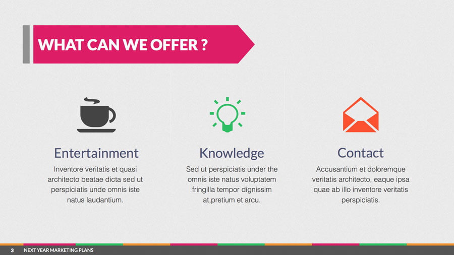
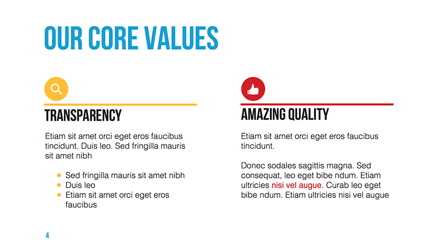
A good PowerPoint presentation should always be easy to read, therefore make use of simple fonts. You can find many really good looking fonts online (like: Bebas Neue, Lato or League Gothic), for free download. Also, make sure that the font is in large size (minimal size should be 30 point), so that the audience can easily read the written text.
Properly Titled Slides
Every slide should be properly titled using clear, bold and easily readable letters. This creates a good impression in the minds of the audience and lets them know the key takeaway.
Simple Backgrounds
When making a presentation, the most effective method to attract the audience’s attention is by keeping the background simple. Remember that complex backgrounds distract the reader and draw his attention away from the content. You can find some inspiration at https://www.toptal.com/designers/subtlepatterns/
Use Charts and Graphics
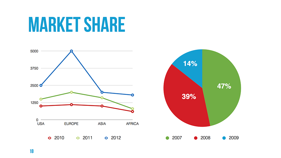
“A picture is worth a thousand words.” Using charts and graphs in your slides is one of the best ways to convey a thought to the audience. This helps in keeping the attention of the audience on your work.
Stay Focused
When explaining an idea, it's quite possible to begin to ramble. Make sure that you create a proper outline and write down only what is necessary. Each slide should lead to the next without causing a break in the train of thought or the flow of the presentation.
Limit the Number of Slides
When it comes to a presentation; the more is never the merrier. Try to convey your information in as few slides as possible, so that you don't bore the audience with too many slides.
Good Communication Skills
Good communications skills are imperative to communicate the idea that your presentation represents. The worst thing you can do is to put lot of text on your slide. First of all, your audience will focus on reading it and they will not hear what you are saying. Second, if you decide to read everything directly from the slide, you will bore everyone, that’s for sure. The point is to find a balance between the text on the slide and the things you want to say.
Make it Visual
At the end of your presentation you can prepare a slide with an infographic that is going to sum up everything you were talking about. If you use a short, attractive graphic form, you can be sure that what you said will be remembered.
Note: Marta works for Improve Presentation, a group of heroes doing battle against bad looking presentations. Our mission is improving slides, making them readable, clear and elegant. We create presentation templates that are easy to work with and help people prepare visually attractive slides. If you need a great looking PowerPoint template, come and visit us at: http://www.improvepresentation.com/


Great tips from Marta! It’s interesting, a few years ago I sat in some training from an expert on delivering presentations on the web vs in person. His philosophy? Have a zillion slides and keep ’em moving to keep the audience engaged not only with your talk but with your on-screen content. Clearly, in person, a zillion slides can be distracting and even become comical. Is it really different on-line? Going to give it some thought!
Alli, thank you 🙂 a zillion slides? not only distracting, but for sure will put audience to sleep.
Alli, I think having a zillion slides can be very off-putting to watch, even online. Here’s discussion of a case in point:
http://wp.me/p1PHR3-G4/#comment-3540
Marta, I strongly agree with most of your points. I especially like your tip about each slide leading smoothly to the next to maintain the flow.
One thing really struck me though: The slides shown in your post seem to contradict some of your points. Most notably, a lot of the text on them looks to be much less than 30 points.
I agree with Nancy Duarte, Garr Reynolds and Jerry Weissman when they say to limit each slide’s content so people just need 3-5 seconds to absorb it. If audiences can read at around 180 words per minute (3 words a second), that means a limit of about 15 words on a slide. Having so few words (and preferably charts or pictures, as you say, instead of words) means you can make the font nice and big.
(For links and quotes from those 3 authors about limiting the words on each slide, see http://remotepossibilities.wordpress.com/2013/06/22/how-many-words-do-you-put-on-each-slide/#experts )
Hey Craig – just to be clear those slides are at about 60% their full size. Unfortunately, you can’t put a full size slide into Wordpress.
Every time I read your blog, I’m enriched with knowledge on how to create better presentations. I really want to thank you for sharing these tips with us.
Arpit
authorSTREAM Team
Your point on limiting the niumber of slides can be misleading. I see people who are asked to prepare a fixed number of slides cram a lot of information on each slide, reduce the font size to make it all fit, which is negative, just as you say in a later point: “the worst thing you can do is put a lot of text on your slide.” I think each slide should support the speaker with one message. The total number of slides does not matter. That said, a presentation should focus on a limited number of key ideas.
Wouldn’t having a limited number of ideas also limit the number of slides? I’ve seen a lot of presentations that the speaker has a 120 slides for a 60-minute presentation (and to be honest those slides were still crammed with information). I see your point that you want to be crisp on your ideas. I’d say the total number of slides does matter because the time limit of presentation matters.
I’m combing SlideShare, reading blog posts and trying to ride the balance for a great deck. I’ve never spent $$ on my deck, but for this upcoming prez, I want to be really polished. Thanks for the tips.
Hi Jayme! When presentations are important – I end up hiring a graphic designer for my slides. I want them to look outstanding and I know he can make them pop. It’s totally worth the money! Good luck with your presentation.
[…] dissertations, blog posts, various presentations, practical hints & tips, along with lots of know-how, real life, down to earth, experiences in delivering good, pragmatic, stunning […]
Your post contain all the important aspects that helps to make a powerful presentation.I think by using chart and graphics we can better describe our presentation. Very nice thought.
presentation edited and design service
Thanks for the article, but it is a little outdated.
Waiting patiently for you to come home and fuck me! https://hdo.ai/DVMQq
Waiting patiently for you to come home and fuck me! https://is.gd/dBsd60